
You’re Nobody Till Somebody Googles You !!!
•
Custom Web Design
•
Website Maintenance
•
Search Engine Optimization
•
Secure Web Hosting Services
•
Mobile Marketing & Design
•
Domain Name Registration
My web design clients include many Fort Collins area small businesses.
Web Design by Jack is the full-time freelance Fort Collins Web Design and maintenance company for your small business or non-profit
organization. I offer website design to fit your needs, your budget and your time-frame. The only limits to my services to you are the limits of
your imagination. I will design your website to be exactly what you want. I create each site individually, to ensure that your website projects
exactly the image you want your company or non profit organization to have.
Web Design by Jack is located in Fort Collins and serving the Front Range with a wide range of services including professional custom mobile
friendly website designs, domain registration, on-line forms, hosting, SEO (search engine optimization), web based e-mail, and website
maintenance. For more information on website design, optimization, maintenance and hosting services, click on the tabs or call me today at
970-218-6783.
What My Clients Are Saying
I wanted to say THANK YOU THANK YOU THANK YOU for everything!!! The site looks incredible and I have gotten some great feedback as to how
beautiful and easy to navigate it is. You are wonderful and I so appreciate all of your advice, guidance and hard work. You are the greatest - and I
mean it! My event on Sunday was BEYOND anything that I could have hoped for and I was so proud to let everyone know about the website and
how this wonderful man from the North (you) made it all come together.
Michelle Weekley
French for Sugar
I am so glad I found you. You are a delight to work with. It was so funny. I told my sister I had several replies to my "quest" for web designers and
that one (you) just seemed like a fit for the farm and I couldn't describe why I felt that way. I told her "he seemed to grasp right away my website
vision." That was you and you have done such a wonderful job! You have more than grasped my vision, you have done wonders with the photo's.
It's made it a fun website to visit - but I'm prejudice too!
Kathy
Tigges Farm
Jack is hands down THE BEST at website design!!!! I hired Jack to redesign my entire website and I am so happy and thankful that I did. From the
beginning of the process Jack was very informative and professional and he aims to please. I was very impressed with Jacks strong Integrity and
how he does what he says he is going to do, when he says he is going to do it. Jack always gets the updated information for my website done in a
very timely fashion & He has a Go Getter attitude that is admirable. Jack is very creative and has added so many new and exciting features to my
website I have gotten several wonderful comments from my customers about how much they love my new site and all Jack has added to it.. I Highly
recommend Jack for all your website needs He is truly Amazing!!!
Melissa Wren
Owner of Sweetheart Goldens & Sweetheart German Shepherds


Phone: 970.218.6783
Email: Jack@webdesignbyjack.com
Cookies and You.
We use cookies on this website.
You are free to manage these
via your browser settings at any
time. For more about how we
use cookies, please see our
Privacy Policy.

Click the button above
to pay your invoice
thru PayPal.


1.
Local Company
2.
20+ Years Of Experience
3.
Personal Service
4.
Never, Ever Outsource Projects
5.
Custom Websites - Not Templates
6.
Fast Loading Websites
7.
Quality SEO Results
8.
I WORK FOR YOU !!!
•
Custom Web Design
•
Website Maintenance
•
Search Engine Optimization
•
Secure Web Hosting Services
•
Mobile Marketing & Design
•
Domain Name Registration
•
Animated Video Advertizing
More Reviews
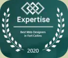
ONE OF THE BEST WEB DESIGNERS
FORT COLLINS COLORADO HAS TO OFFER
Fort Collins Web Design
Fort Collins Web Design

You’re Nobody Till
Somebody Googles You !!!

•
Custom Web Design
•
Website Maintenance
•
Search Engine Optimization
•
Secure Web Hosting Services
•
Mobile Marketing & Design
•
Domain Name Registration
ONE OF THE BEST WEB DESIGNERS
FORT COLLINS COLORADO HAS TO OFFER
My web design clients include many Fort Collins
area small businesses.
Web Design by Jack is the full-time freelance Fort
Collins Web Design and maintenance company for
your small business or non-profit organization. I
offer website design to fit your needs, your budget
and your time-frame. The only limits to my services
to you are the limits of your imagination. I will
design your website to be exactly what you want. I
create each site individually, to ensure that your
website projects exactly the image you want your
company or non profit organization to have.
Web Design by Jack is located in Fort Collins and
serving the Front Range with a wide range of
services including professional custom mobile
friendly website designs, domain registration, on-
line forms, hosting, SEO (search engine
optimization), web based e-mail, and website
maintenance. For more information on website
design, optimization, maintenance and hosting
services, click on the tabs or call me today at
970-218-6783.
What My Clients Are Saying
I wanted to say THANK YOU THANK YOU THANK
YOU for everything!!! The site looks incredible and I
have gotten some great feedback as to how
beautiful and easy to navigate it is. You are
wonderful and I so appreciate all of your advice,
guidance and hard work. You are the greatest - and
I mean it! My event on Sunday was BEYOND
anything that I could have hoped for and I was so
proud to let everyone know about the website and
how this wonderful man from the North (you) made
it all come together.
Michelle Weekley
French for Sugar
I am so glad I found you. You are a delight to work
with. It was so funny. I told my sister I had several
replies to my "quest" for web designers and that
one (you) just seemed like a fit for the farm and I
couldn't describe why I felt that way. I told her "he
seemed to grasp right away my website vision."
That was you and you have done such a wonderful
job! You have more than grasped my vision, you
have done wonders with the photo's. It's made it a
fun website to visit - but I'm prejudice too!
Kathy
Tigges Farm
Jack is hands down THE BEST at website design!!!! I
hired Jack to redesign my entire website and I am so
happy and thankful that I did. From the beginning
of the process Jack was very informative and
professional and he aims to please. I was very
impressed with Jacks strong Integrity and how he
does what he says he is going to do, when he says
he is going to do it. Jack always gets the updated
information for my website done in a very timely
fashion & He has a Go Getter attitude that is
admirable. Jack is very creative and has added so
many new and exciting features to my website I
have gotten several wonderful comments from my
customers about how much they love my new site
and all Jack has added to it.. I Highly recommend
Jack for all your website needs He is truly Amazing!!!
Melissa Wren
Owner of Sweetheart Goldens & Sweetheart
German Shepherds

More Reviews
1.
Local Company
2.
20+ Years Of Experience
3.
Personal Service
4.
Never, Ever Outsource Projects
5.
Custom Websites - Not Templates
6.
Fast Loading Websites
7.
Quality SEO Results
8.
I WORK FOR YOU !!!
•
Custom Web Design
•
Website Maintenance
•
Search Engine Optimization
•
Secure Web Hosting Services
•
Mobile Marketing & Design
•
Domain Name Registration
•
Animated Video Advertizing
Phone: 970.218.6783
Email: Jack@webdesignbyjack.com
Cookies and You.
We use cookies on this
website. You are free to
manage these via your
browser settings at any
time. For more about how
we use cookies, please see
our Privacy Policy.
Click the button above
to pay your invoice
thru PayPal.
Fort Collins Web Design
Fort Collins Web Design